
COLUMBIA, Mo. – The Formula One preseason is in full swing, with car launches and testing underway as the weeks roll by to the season opener at the Australian Grand Prix. A lack of racing action doesn’t mean fans of the sport can’t have a bit of fun, which is why I have ranked the 11 liveries that will make up the F1 grid in 2026.
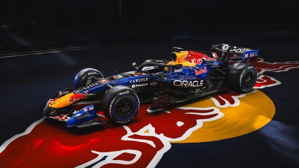
- Red Bull Racing
Truthfully, the F1 liveries for 2026 have been rather uninspired. Several teams opted for a “copy and paste” livery design from previous seasons, likely to devote their time and energy into the one-off designs that each team will choose to debut throughout the season.
Despite this, Red Bull went for a different approach. After multiple seasons sporting the classic dark blue/black solid background, the English-team has opted to go for a splash, with a deep, playful blue on top that cleverly fades into a black void for its lower half. The red bull that sits just behind the driver is still the same with its yellow backdrop, but the chromatic sheen that the design team added to the whole car allows the livery to feel alive. All of which to say, Red Bull designed the best looking car for 2026.
- Haas F1 Team

Haas has yet to win a Grand Prix through ten years of wheel-to-wheel racing, but in 2026, the Haas design team definitely made a winner. It is not an earth-shattering shakeup like the black and gold car in 2019, but with only black, white and red to work with, Haas really nailed the location of its primary colors.
The red accents really seem to pop as they outline the white body, whilst the black letters and numbers let the fans and pundits alike know which driver is which, and what team they are a part of. In a field of consistent colors and re-used livery designs, Haas is a reminder that a team can make an interesting livery even with just its recognizable brand colors.
- Cadillac

There is something to be said for the first time feel of Cadillac that puts it so high on the list. While a smattering of gold much like the car brand’s logo would’ve really made this livery standout, the biggest advantage Cadillac has is there is nothing to compare it to.
That being said, no photograph can really do the livery justice. Cadillac opted to go for a half-and-half approach to their car, with one side sporting a white backdrop with black lettering, with a black backdrop and white lettering on the opposite side. Arguments over whether the chrome seen in promotional material online will actually be on the car come race time have begun to populate social media, but regardless of that, Cadillac at least hasn’t embarrassed itself in the creativity department.
- Ferrari

Here is when the list starts to get tricky. Most of the teams remaining didn’t go crazy with their 2026 redesigns, instead choosing to go with a consistent look heading into a new era of regulations. Of these teams, Ferrari seemed to hit the right points the best.
For starters, the classic Ferrari red is back and better than ever. Previous cars as seen in 2025 and 2024 for example were just a touch too far, but this year, viewers both at home and in person will be able to tell when a Ferrari comes racing down the track. However, one cannot gloss over the white on the car. First, it was the random white stripe on the back of last year’s car. Now, it’s a pool of white that the drivers will sit in, with the cursed HP logo clear for all to see. What makes things worse is the black halo that doesn’t match at all in the context of the color palette. Why not white or red? All of this to say, Ferrari sits, exactly where it sat in last year’s Constructor standings. A respectable, but far from the leader’s fourth place.
- Aston Martin

Honestly, there isn’t much to say about the 2026 Aston Martin livery. A fun challenge for any viewer of F1 is to line up pictures of the Aston Martin car from the past five seasons, and to guess which came from which year. Spoiler alert: it is incredibly hard.
In an era where new cars are hitting the track, it’s nice at least to know that the popular turquoise color isn’t going anywhere.
- Racing Bulls

Here is where I may start losing some support over these rankings. Racing Bulls, the junior team of Red Bull Racing, has made a pretty good car all things considered. The more I look at it, the more I actually start to enjoy it. My biggest issue though is what it was clearly made to look like. A can of Red Bull.
I am no hater of Red Bull, in fact I have drank it at least twice in my life. The problem is though, this is not a Red Bull can, this is a race car. When a team has easily the best looking car on track the previous season, and opts to use it for a marketing tool the following year, it immediately devalues any of the interest I had in watching the car on track. The colors themselves are a fine selection, and the Ford logo really does look right on an F1 car, but all in all, Racing Bulls sits exactly in the middle of the rankings.
- Alpine

Alpine is a bit of an anomaly when it comes to these rankings. On the one hand, I actually quite like the design, the blue and pink have always flowed well together. On even closer inspection, I find myself enjoying the pink accents, specifically on the front and rear wings of the car.
The problem though is its a continuation of the trend seen with Ferrari, Aston Martin and more cars to follow. It really is just the same design as the 2025 car, save for a deeper shade of pink. As such, it slots in at No. 7.
- Audi
Before I go into the negatives, let me say this: Anything Audi could have put out this year would have been far superior to the Kick Sauber green F1 fans had to suffer through for two years. It was just awful. So for that, Audi gets some points in its favor.
Regardless, this is still just an “ok” livery. Realistically, this livery makes the car feel like it is just for show. To sit in front of the Audi factory as it welcomes employees and visitors alike. Yet this is the car that will hit the track in 2026. The colors are alright, though it gives the impression of a battery more so than a race car.
- Williams

Seeing as Williams is my favorite team, putting it in third-to-last really hurts. Honestly there isn’t much wrong with the Williams car as the majority of it is the same as in 2025. I just have a major problem with one specific area. The lighter blue that holds the Barclays logo. It doesn’t flow well with the dark Atlassian blue and it heavily clashes with the overall color scheme of the car.
I still enjoy the top half’s look, and the battery design on the engine air intake is always a nice touch in collaboration with the Duracell power company, but I just cannot get over that Barclays blue.
- Mclaren

Surprise surprise, my least favorite team on the grid is in second-to-last, but not for that reason. While the Mclaren car has always been decent throughout this era of modest livery design, it seems like the Papaya are going backwards not forwards.
Their team nickname, papaya, is literally based off of one of the most colorful fruits available on the planet, and yet Mclaren continue to add more and more black, year by year with its livery. F1 fans aren’t asking for a return to the Marlboro color days, but they are asking for a car of life, not a car of bland, unoriginality. Please do better Mclaren, one cannot win back-to-back Constructors titles and remain this mundane.
- Mercedes

Truthfully, I hope this is not the car design Mercedes has chosen in its aims to return to the top spot of F1. If so, fire the design team immediately (I kid). In all seriousness though, why this design?
It is too chaotic for starters. A grey to black color fading from the front to the driver’s seat, random gray blocks along the side and weird, three-pointed stars along the back? It is too much for the eyes. It’s as if they said, “go nuts,” to a group of middle schoolers, and let them throw shapes and colors at the wall and use what stuck. It may be harsh, but it is the truth. Mercedes, known for its history of winning, slots in plum last in the 2026 F1 livery rankings.